This year's Hampton Court Flower Show has been, as I said in the last post, all arcs and anniversaries. The circle has arrived with a vengeance. Straight lines are still in evidence, but I fear they'll soon be as scarce as curves once were. Here are the arcs:
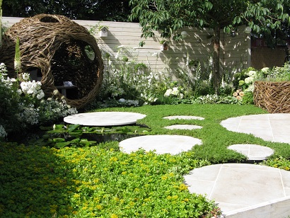
I don't think you could have got more circles into Living Landscapes City Twitchers by Sarah Keyser of Coucou Designs. It also had willow, Egyptian Limestone, sedum turf, a chamomile lawn and a Prunus Tai Haku - because its spreading branches are easy to hang (round) bird feeders in. (Won Silver Gilt.)

Round planters, curved seat (in bleached oak to match the bleached wood behind) and...(we're not finished)...
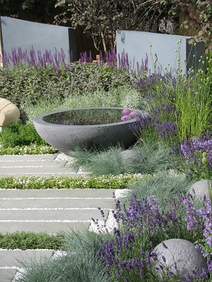
...a different round planter and balls in Rae Wilkinson's blue-toned Living Landscapes HUG (Healing Urban Garden). (Won Silver Gilt.)
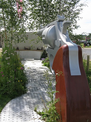
Two circles joined by a line, with a small round pond - Ready...Aim...Flower! (Won Silver)
Excuse me while I digress a moment:

Designer Simon Webster, I was told by another designer, had a lot of stick for including a gun. "No, I haven't," he said. "People have been able to look past that." Anyway...

...look at the fun you could have with it. Concept? The journey from being under a destructive influence to gaining recovery. Moral of garden? Don't put too much black ink in your pond - it leaks into the render above.
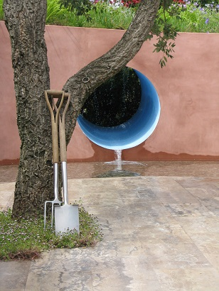
SABO: THe Circle of Life, designed by Stefano Passerotti. It's all in the name, really. The cork oak was lovely.The Travertine paving was gorgeous. The sound of water was soothing. The planting was delicate. I thought it less than the sum of its parts. (Won Silver Gilt.)
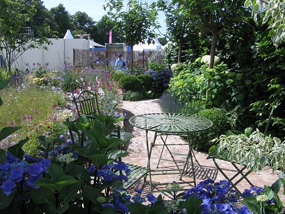
Squire's Garden Centres: Urban Oasis. A curve leading to a round, with another round table.
Another digression:

Remember Squire's garden last year? It was the first time they'd done a garden designed by people within the firm. This year's designer Ian Hammond said it wasn't naturalistic enough, it didn't flow and colours clashed (which judges don't like, apparently).
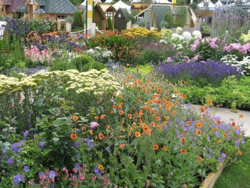
Ian said they'd learned a lot. "Give yourself plenty of time. You don't appreciate how many plants are needed. Be patient with it. The sooner you get your plants in, the better, so they can fill out."
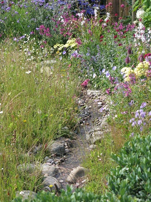
I thought they'd created a charming, relaxed garden, even if it still only got Silver Gilt.
Back to the arc (as Noah said when the first raindrop fell):
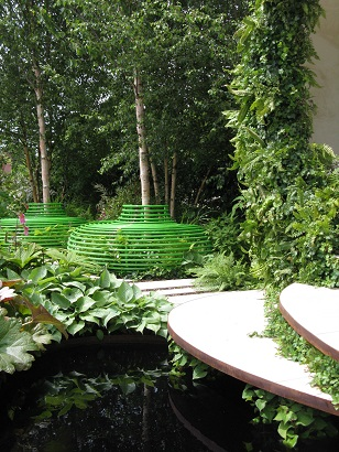
Anne-Marie Powell balanced curved paths and these curved steps and round seats with plank paving of various sizes.
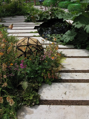
One of only two of the main show gardens to gain Gold.

The Wellbeing of Women designed by Wendy van Buren, Claire Moreno and Amy Robertson. A curved path to a round patio. Incidentally, inked water was very much in this year - I guess designers like it 'cos you can't see the debris collecting in the bottom. (Won Silver Gilt.)
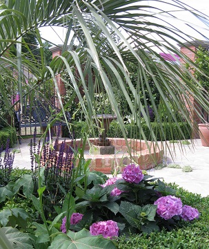
A polite courtyard - Great Gardens of the USA, Charleston by Sadie May Stowell for Brand USA (Won Silver)
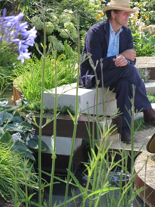
I'd show you the Vestra Wealth Garden - curved path, round amphitheatre, but I think we've just had too many circles. Anyway, someone got in the way when I was trying to photograph it.
Finally, an accolade to Sarah Harris of the DialaFlight Synaesthesia Garden. No arcs and, to be honest, while the idea was interesting, the tent itself wasn't that exciting - white flowers lit by colours cycling on a loop.
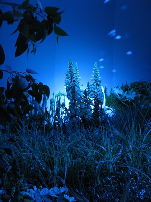
But on the first day of the build, Sarah's 34-year-old partner had a stroke and was hospitalised in Leeds. She spent a week up there and only had a week to build the garden. You have to hand it to her that she managed a garden at all. She must have felt as if she was rushing aound in circles.


Comments