While the general verdict seems to be that the gardens at RHS Chelsea showed more individuality this year, to me one one form of planting predominated. The colour wheel has swung on a notch from last year's cool bluesy notes to warmer pinks and purples. And I love the emphasis on big, blowsy blooms. Here's a selection from around the grounds:
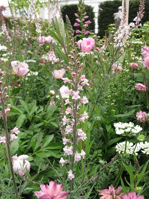
Planting on Breakthrough Breast Cancer in Fresh category, designed by Ruth Willmott
And:
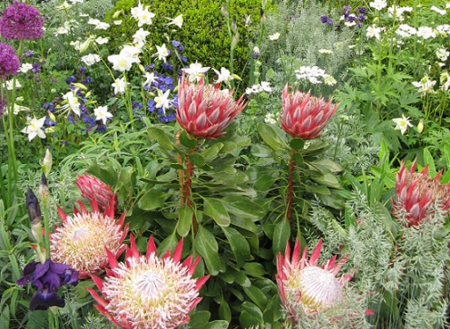
Rather gorgeous Protea in The Time in Between, designed by Charlie Albone for Husqvana.
And:
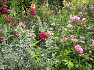
Planting on the M&G Retreat Garden, designed by Jo Thompson
And:
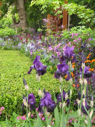
Planting by Chris Beardshaw on the Morgan Stanley Healthy Cities Garden,
Hard landscaping? Well, slate had rather a starring role, as we shall see.
But how about the gardens?
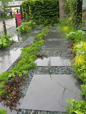
First up from the Press Tent (please could we have more lockers, and ones that work?) was Darren Hawkes' Brewin Dolphin Garden. The more I looked at this, the more I liked it.
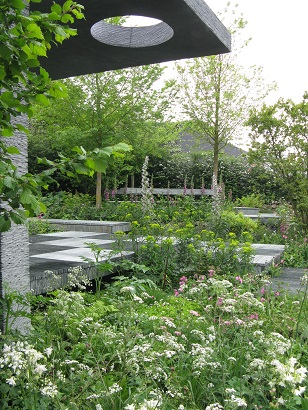
The Brewin Dolphin Garden by Darren Hawkes. Won Gold.
The chequerboard effect caused by turning the slate ninety degrees lightened the whole.
I did ask if the slate had been treated to prevent growth, but Darren said, slate being of very low porosity, this wouldn't be a problem. I looked at the tiny little niches, thought of my gravel at home, and would like to reserve judgement on that.
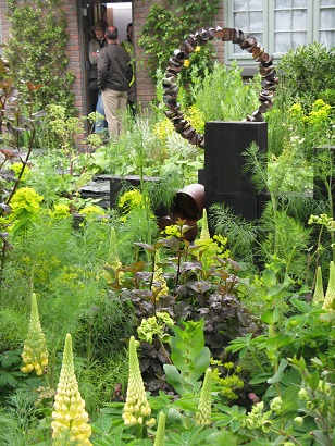
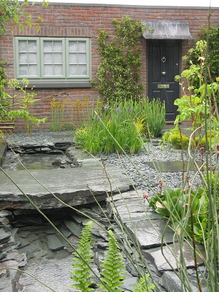
It's inspired by 1930s architecture but, being as Darren's from Cornwall and so is some of the slate, it feels like more than that. Barbara Hepworth's monolithic sculptures, inspired by the Cornish countryside, often include holes. Here the aperture in the stone at the back reminded me of Men-an-Tor. The one above the well has been placed so that the sun shines directly on to the well below at midday - giving a sacred element to the water. And the horizontal slab in which this hole has been placed reminded me of a dolmen - maybe Lanyon Quoit.
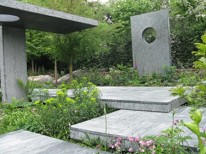
Slate - 41,500 pieces cut and glued together by hand, seven people working from January to the last week of April
The whole, with campion, foxglove, erigeron, "has a slightly abandoned feel of a garden that's just about to spill over into wildness" as Darren told me, but it's kept in check by the straight-cut slate. The garden won Gold.
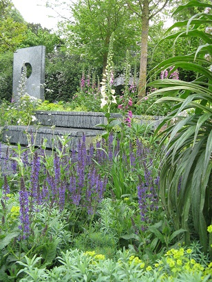
More waftiness with mauve accents in the planting from Darren Hawkes.
Turn round from Derren's Cornish woodland feel, and you met Dan Pearson's bit of Derbyshire. Actually, if you'd told me he'd humped a triangle of countryside to Chelsea, I might have believed you.
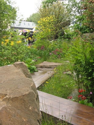
Dan Pearson's Best in Show garden also won Gold
Everyone I talked to said it was marvellous. This was the most appealing view I could find:
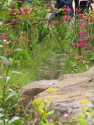
It's quite obviously a tour de force of construction, scale, and impression of wilderness.
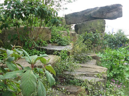
Individual plants were lovely.
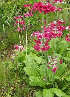
But for me? No, sorry. Didn't do it. Undoubtedly clever, but for me it's a theatre set, emulating a nature. Very much the work of someone at the height of his game, confident and not afraid to go out on a limb. In my book, though, Nature, carefully reconstructed and obviously edited to perfection, needed (I'm sorry, this is going to sound obscene) a little more Man in her.
It was also one of what I came to think of as the "exclusive" gardens.
Next along the row, not in line for judging, was amateur Sean Murray's Great Chelsea Garden Challenge garden. It is "for a couple of keen gardeners nearing retirement" and "shows how a front garden can be both beautiful, with an abundance of plants, and practical, with off-street parking".
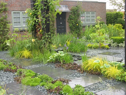
I was disappointed. The weather didn't help, but it was unremittingly grey (yes, I know the RHS campaign for front gardens is Greying the Green, so...). It was also about twice the size of the footprint of many of the actual houses currently being built in this country.
Here's the parking space:
Park your artic here...
There was lots of emphasis on recycled materials. I wonder about the empathy between the soon-to-be-retired couple and all those rusty tin cans.
Still, he made the surface interesting with different levels.
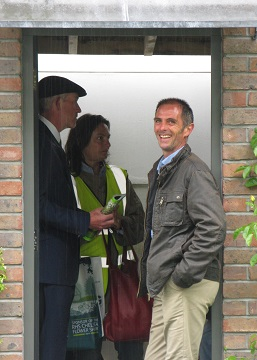
And he certainly looked happy!
A rare dry spot. Lucky Sean
After all that grey, the next was a real tonic. The Hidden Beauty of Kranji, by John Tan and Raymond Toh, bringing to a grey morning the exoticism of Singapore:
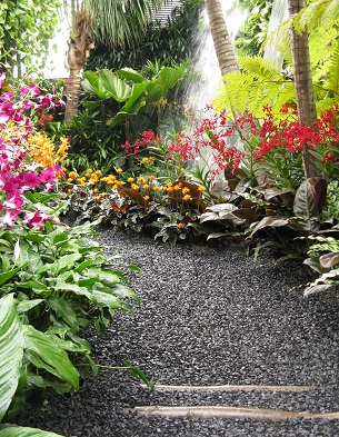
Won Silver-Gilt
Exotic and bursting with sound and colour:
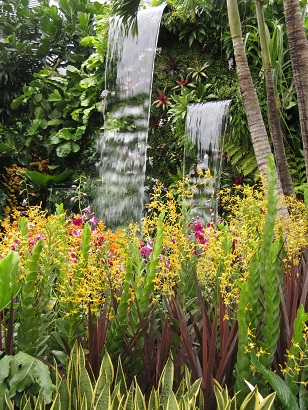
Of the others along the Main Avenue, Marcus Barnett's Telegraph Garden had a certain style - actually that's de Stijl, the art movement that inspired him. Strapline for the de Stijl movement? "The object of nature is man, the object of man is style" - it's a principle that I'd have liked to see more of in the Laurent Perrier garden. This was calm, soothing, with blocks of colour...
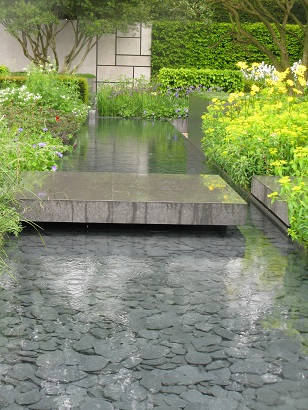
Won Gold
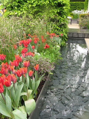
...and - ooh, look - slate.
The Beauty of Islam by Kamelia Bin Zaal was monochrome in green and white.
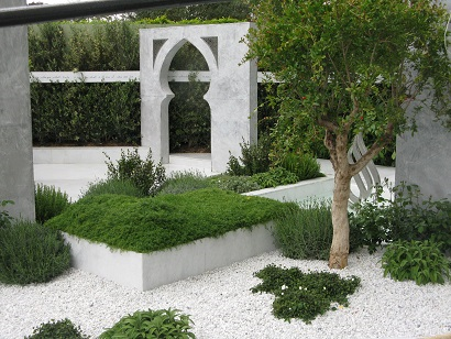
Won Silver Gilt
Here's a glimpse of Charlie Albone's The Time In Between - it's quiet place to sit and communicate:
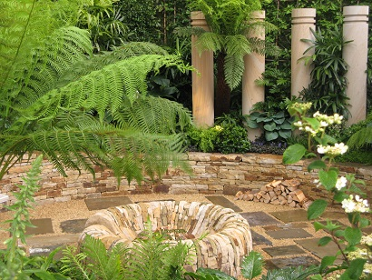
Won silver gilt
And James Basson's delightful Perfumer's Garden in Grasse:
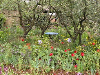
Won gold
Now, when I say "exclusive" gardens, I mean those that really didn't seem much interested in showing a public face. Dan Pearson's didn't really invite you in, and it was difficult to see much of Jo Thompson's, though I did catch a bit of pond:
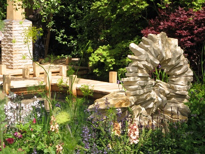
Won silver gilt
Of all, though, The Living Legacy Garden designed by Andrew Wilson and Gavin McWilliams, commemorating Waterloo, was extraordinary. It had decided to completely turn its back on the visitor. The picture in the catalogue shows a view through the gates towards the point at which the photo below was taken. From there it looks rather interesting.
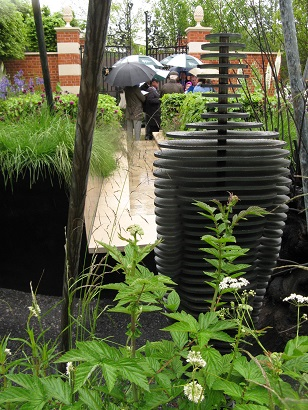
Won Silver Gilt
But it didn't give a Wellington Boot for showing itself off and seemed to me to be extremely unfriendly, even down to the "keep out" signals from the "lances" along the boundary:
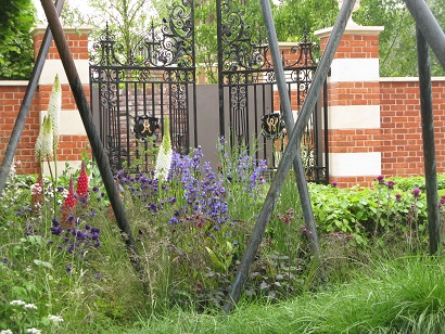
Isn't it odd?
Coming next: Fresh gardens and my two favourites for People's Choice.


Recent Comments